Synera Music Festival
The brief
Craft a distinctive brand identity for Synera, a new global dance music festival launching across Tokyo, London, Melbourne and Los Angeles. The brand needed to capture the energy of world-class headliners and emerging talent, creating a cohesive visual language that could unite four diverse locations under one recognisable, tour-ready identity.


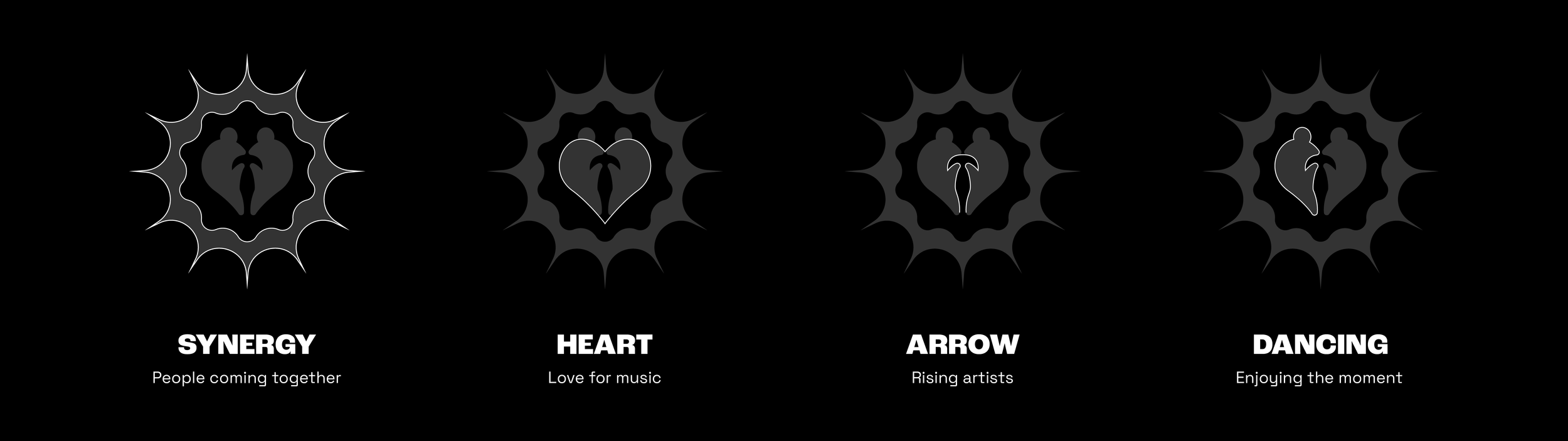
The Synera brandmark was created to unify all four festival locations under a single identity. It combines four ideas: synergy (people coming together), a heart (expressing love for music), an arrow (representing rising talent), and movement (the joy of dancing).
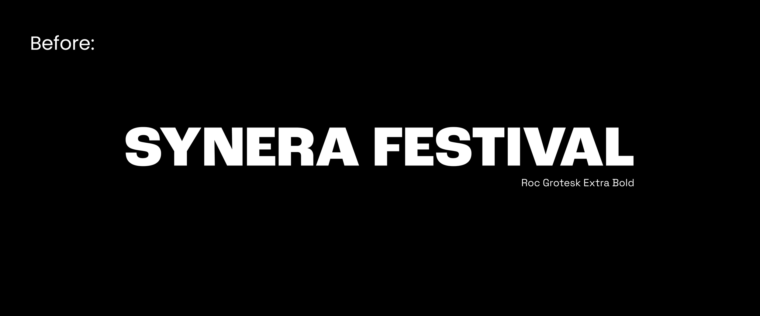
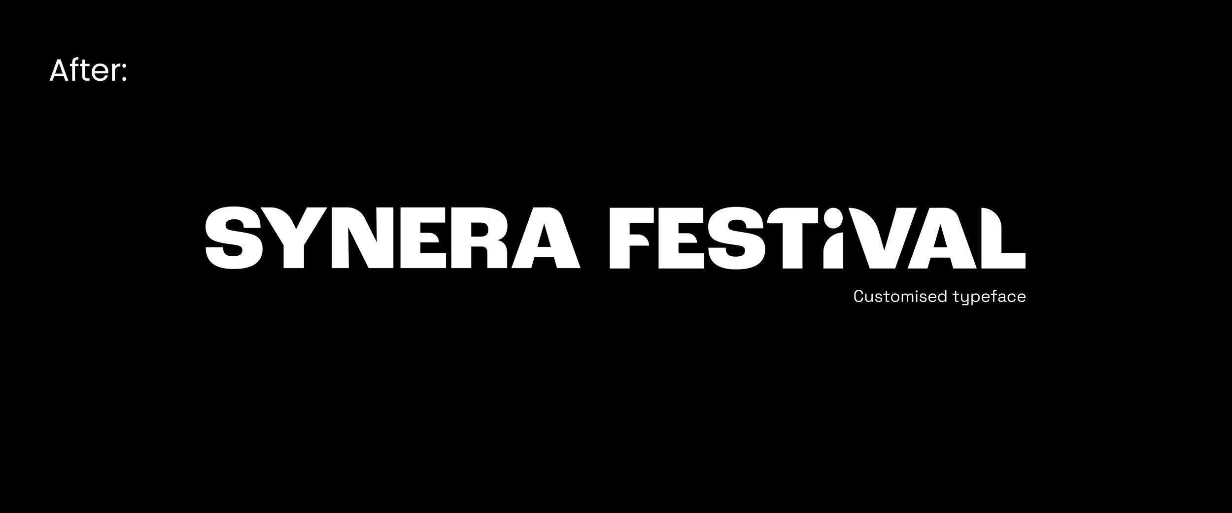
Using Roc Grotesk as the foundation, I developed a customised wordmark that reflects the character of the brandmark. Subtle modifications to the letterforms add personality and movement, making the logo feel more distinctive, memorable, and in tune with Synera’s identity.
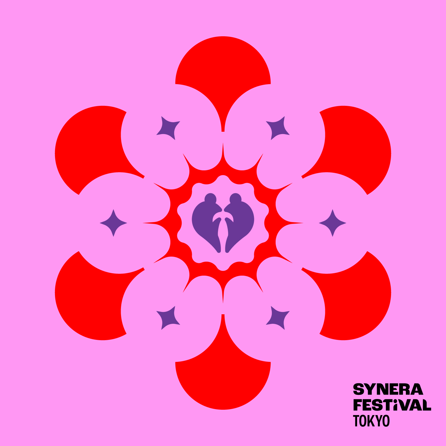
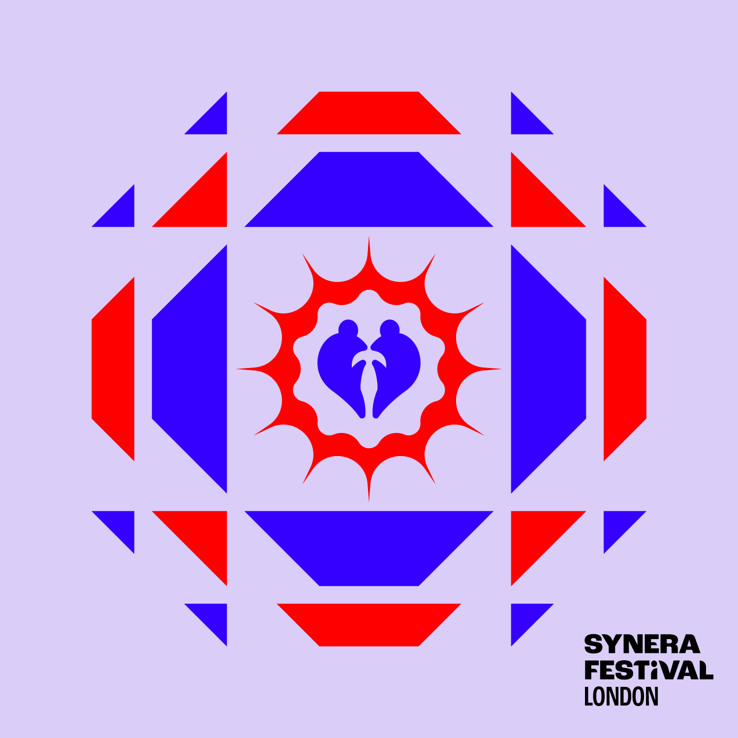
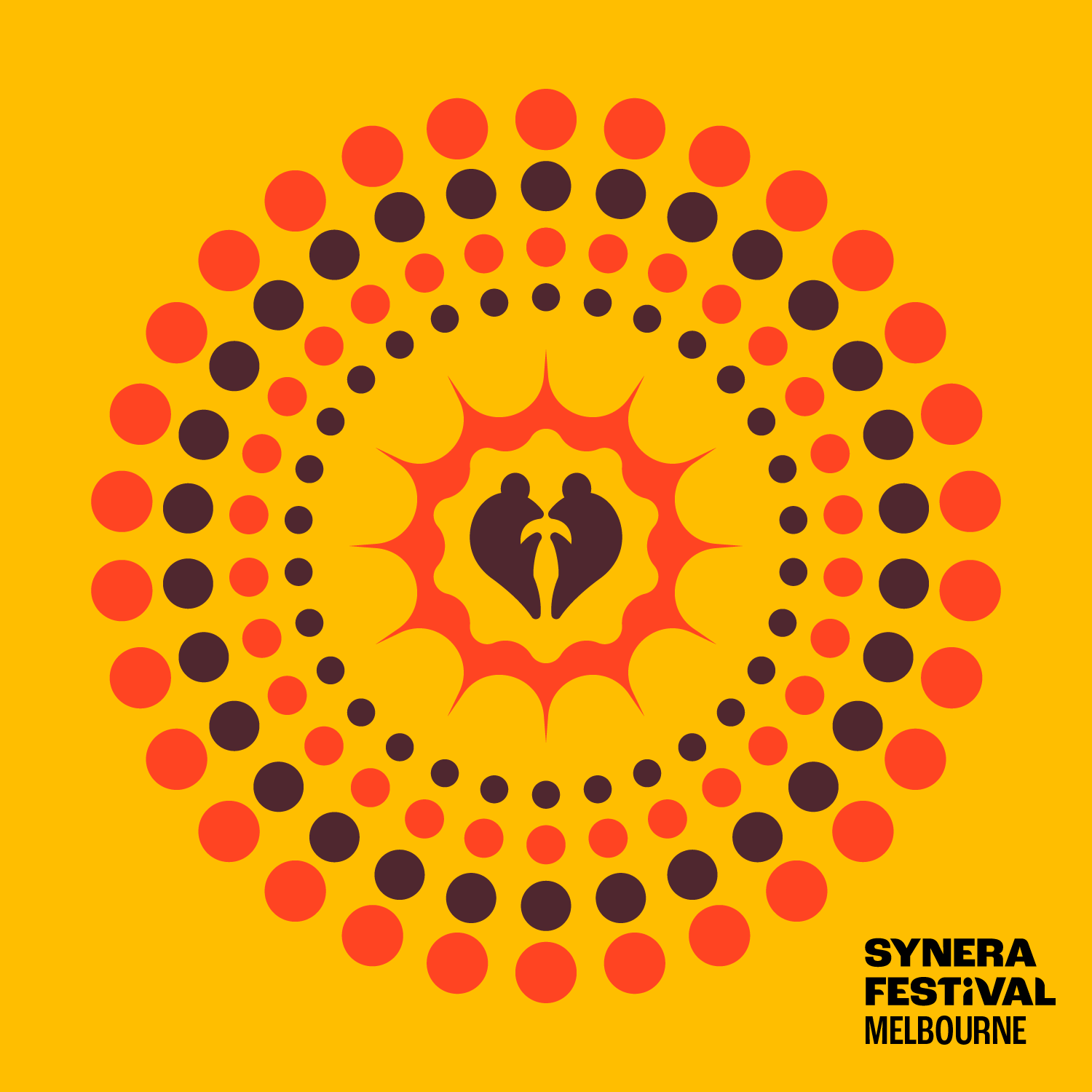
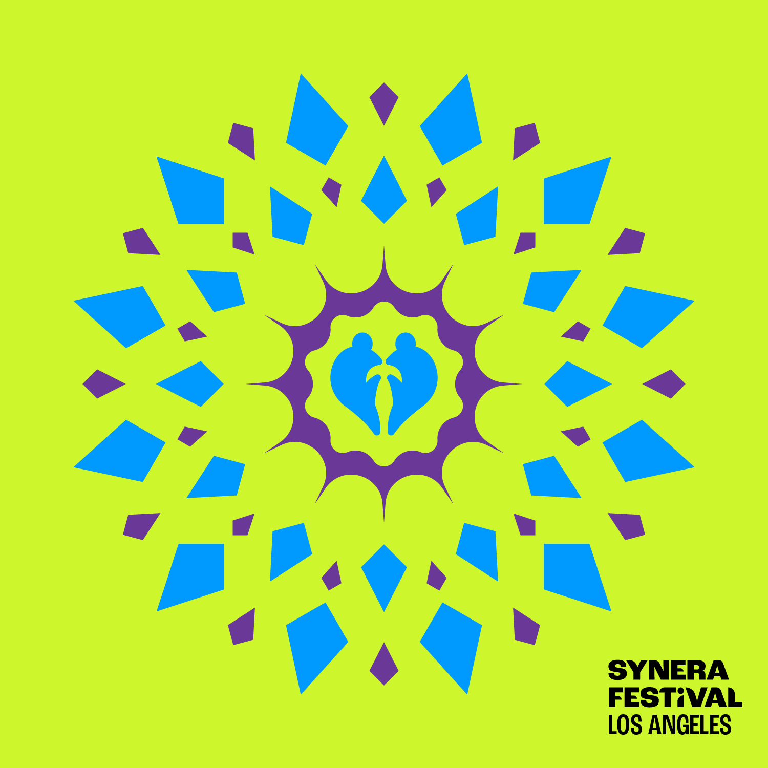
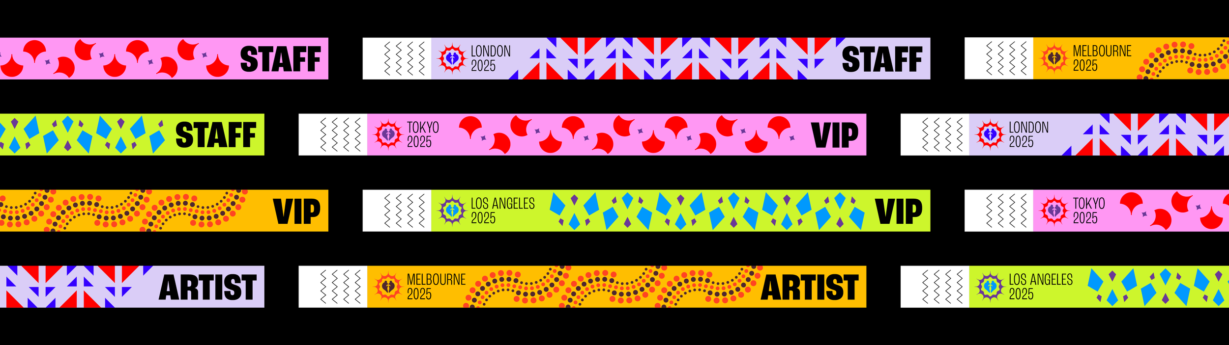
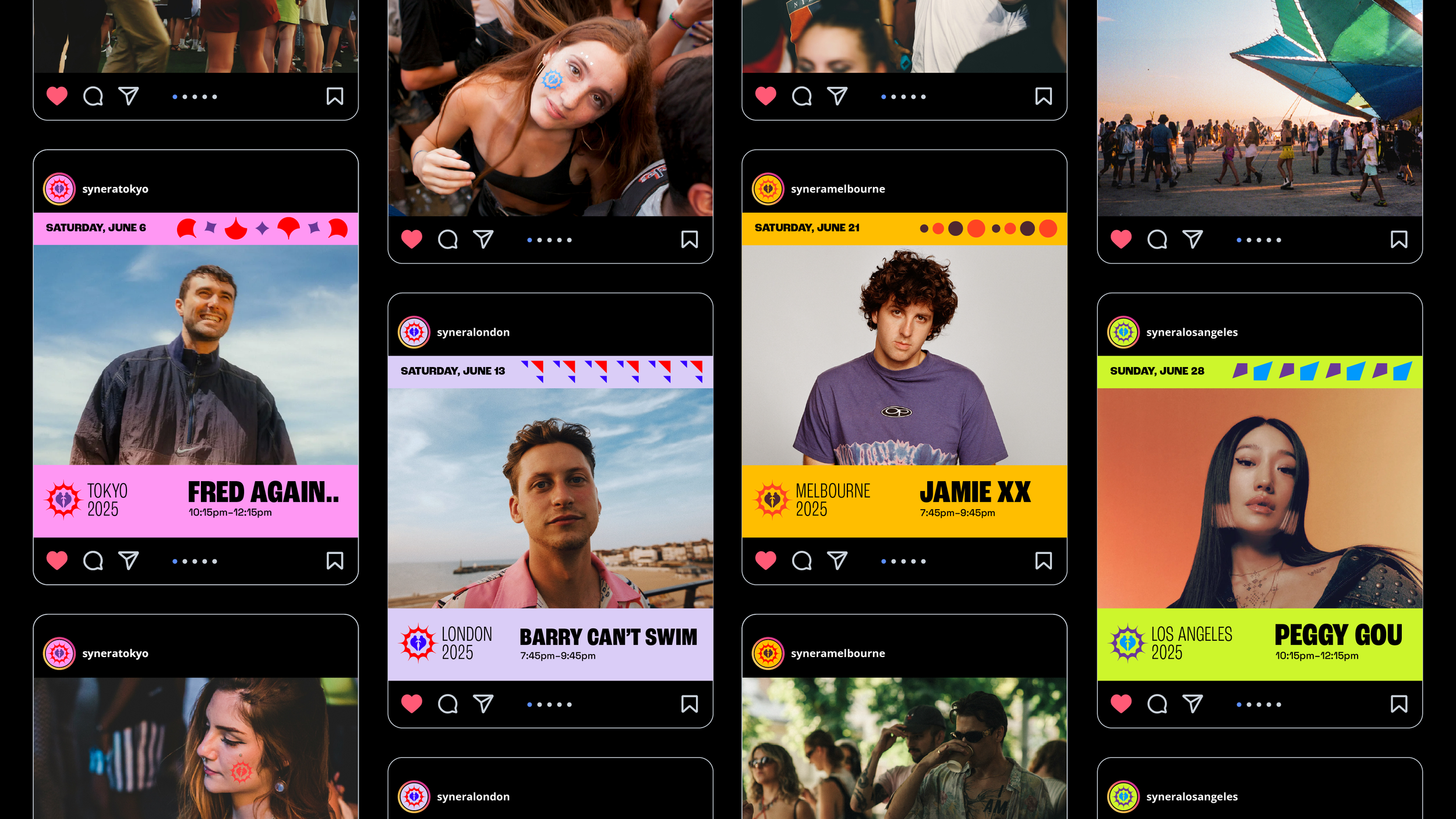
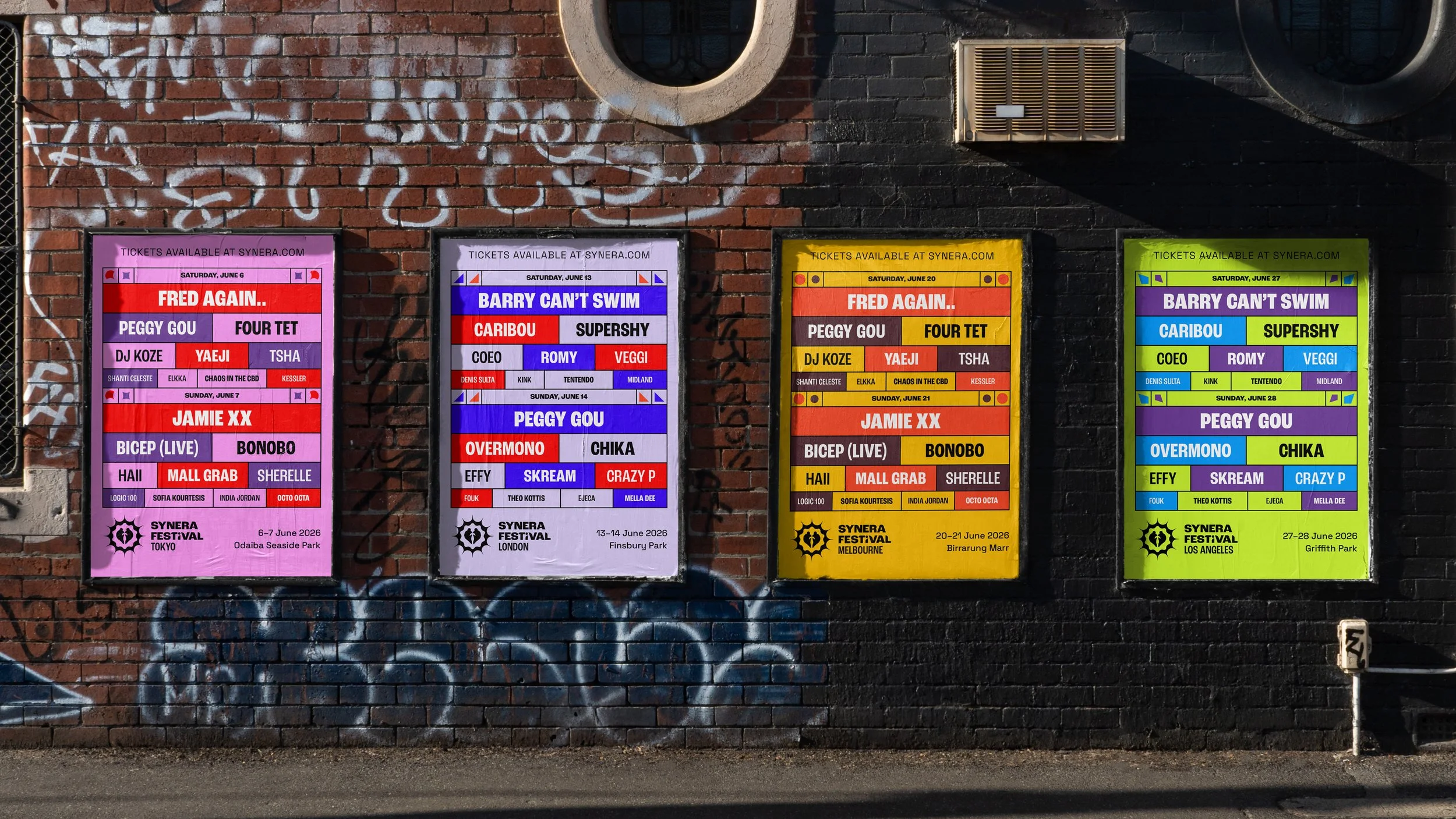
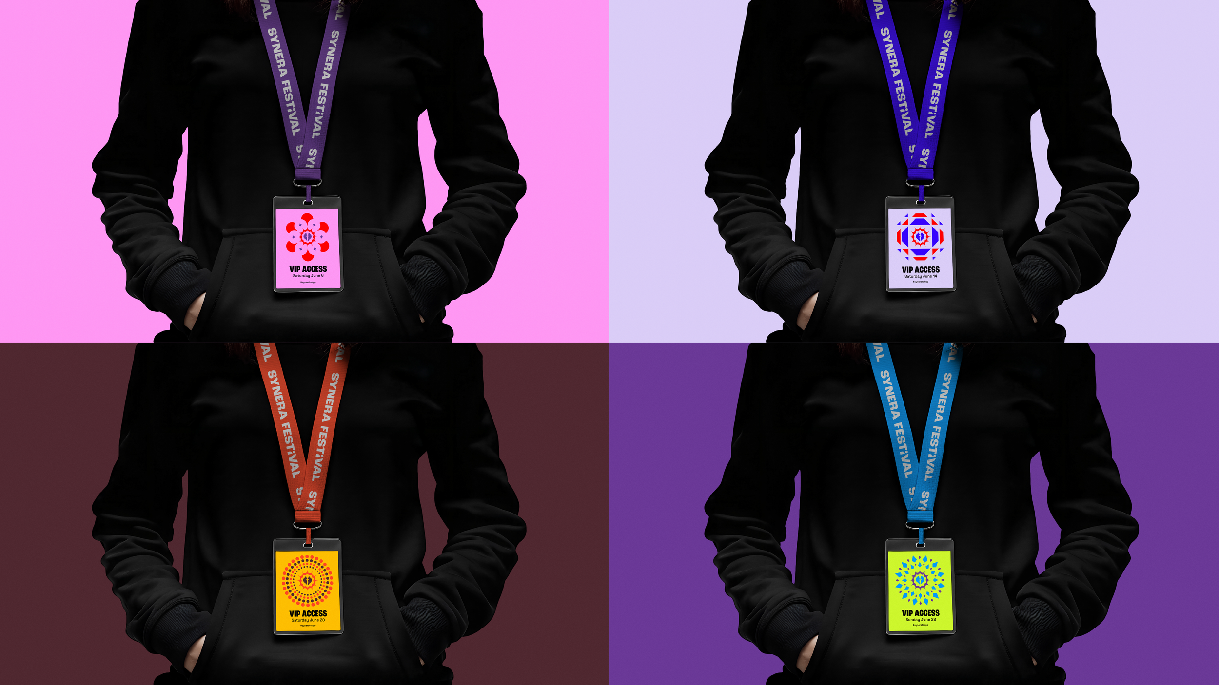
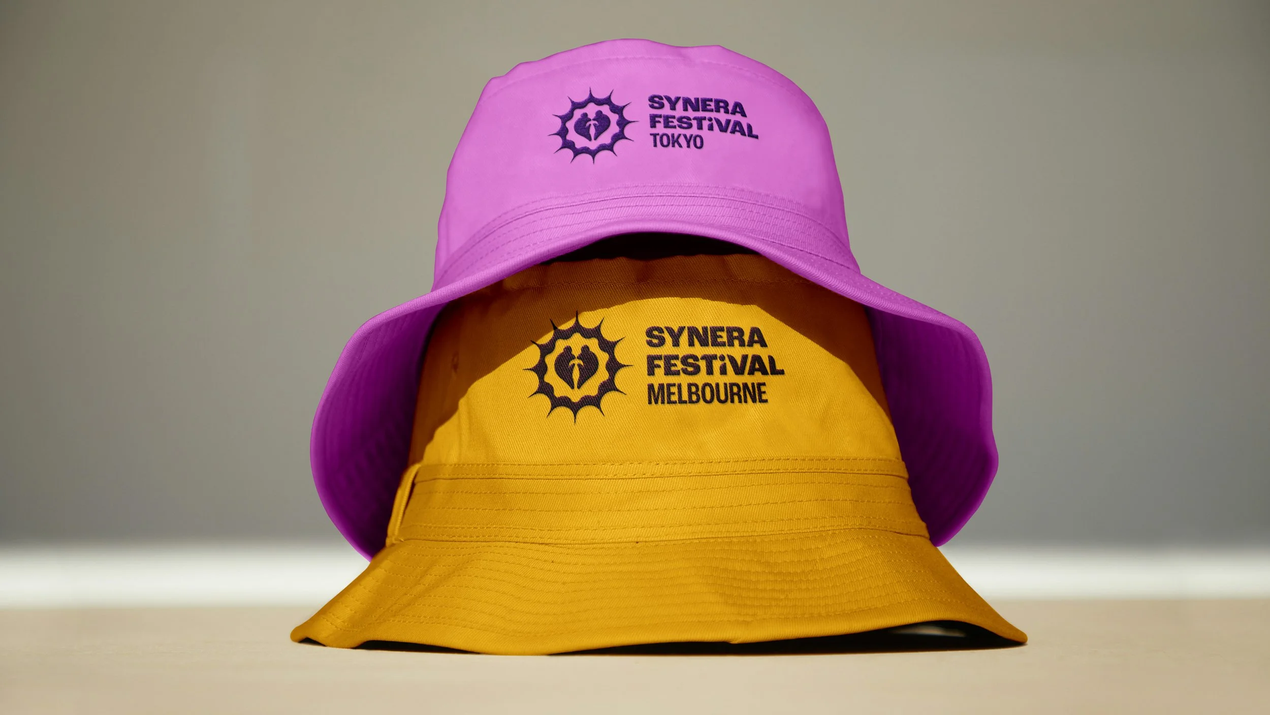
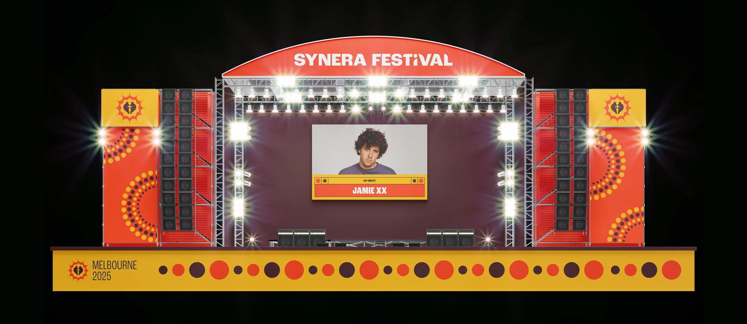
The Synera brand was built to feel vibrant, energetic, and inclusive. With the brandmark established, the next step was to give each festival location its own unique colour palette and pattern system. These elements capture the character of each city while maintaining a consistent visual thread across the global brand. Once these foundations were in place, the wider identity could be developed and applied across all brand touchpoints.