Tyne & Bloom
The brief
The project was to create a brand identity that balances growth, gardening, and lifestyle. The challenge was to design something modern, welcoming, and flexible enough to work across both retail and community touchpoints, while also celebrating the Tyne & Wear region.
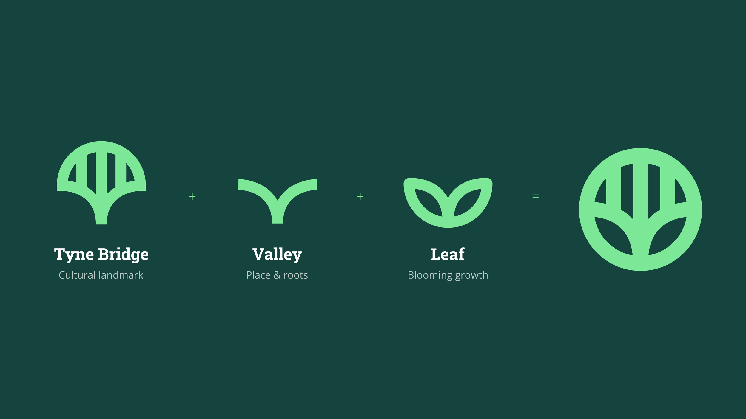
The brandmark combines the Tyne Bridge, a valley form, and a leaf in bloom — symbolising place, growth, and nature in a simple, recognisable mark.
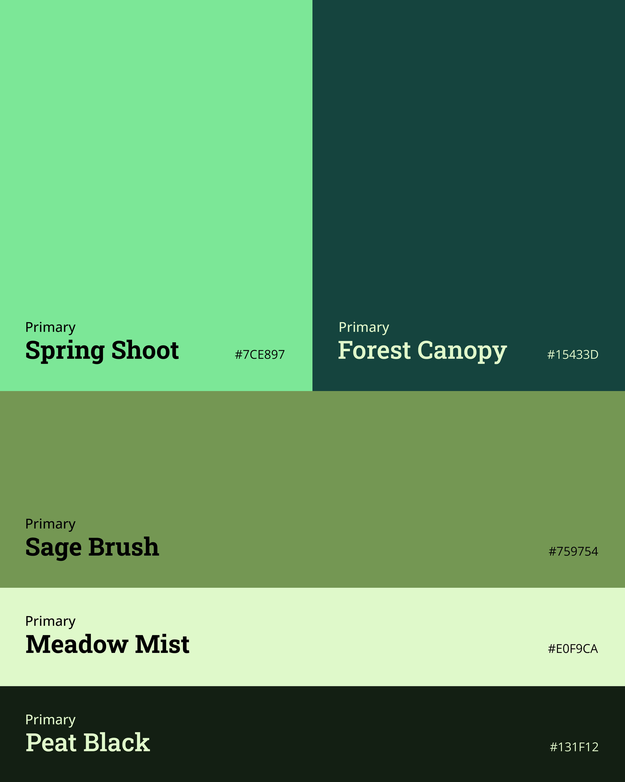
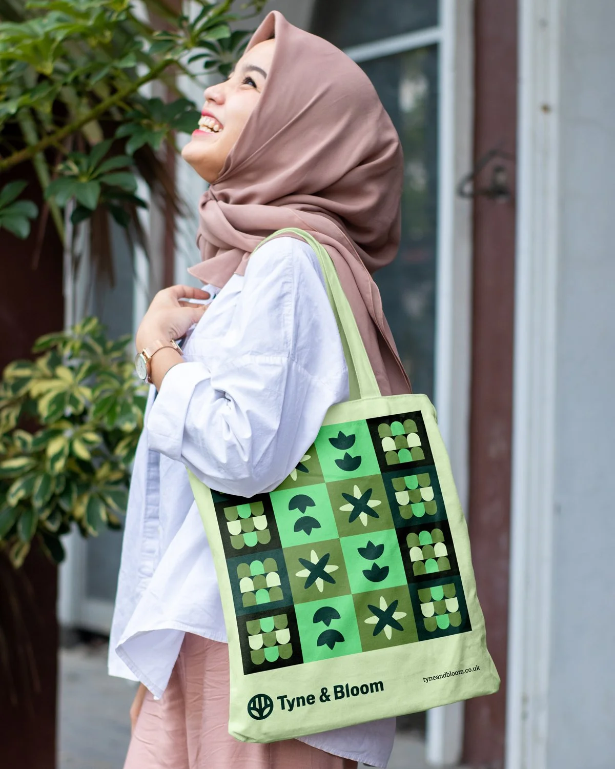
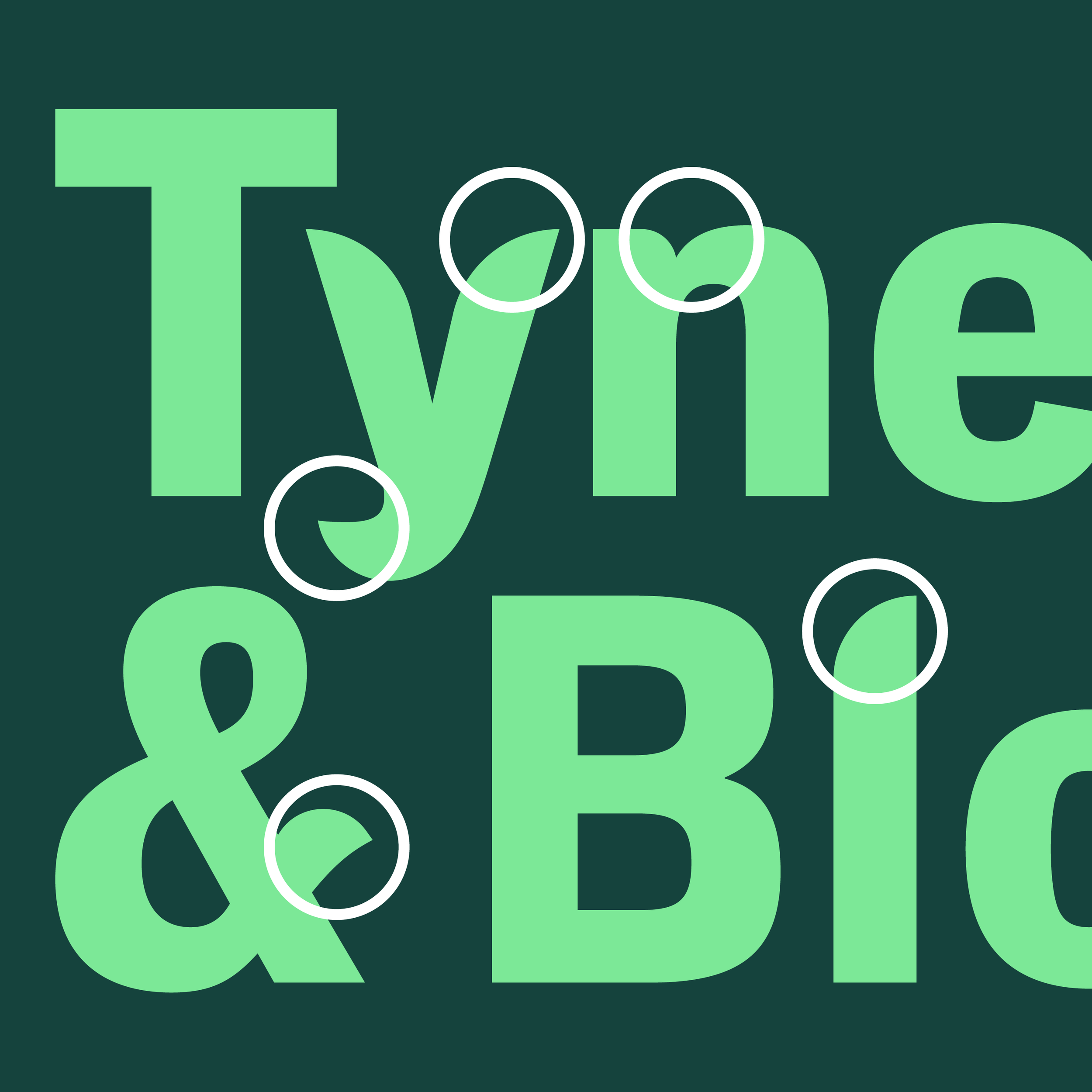
The colour palette is inspired by natural earth tones, grounding the brand in the outdoors and horticulture. To add presence and character, the wordmark was customised with softer curves, echoing the organic forms found in plants and nature.

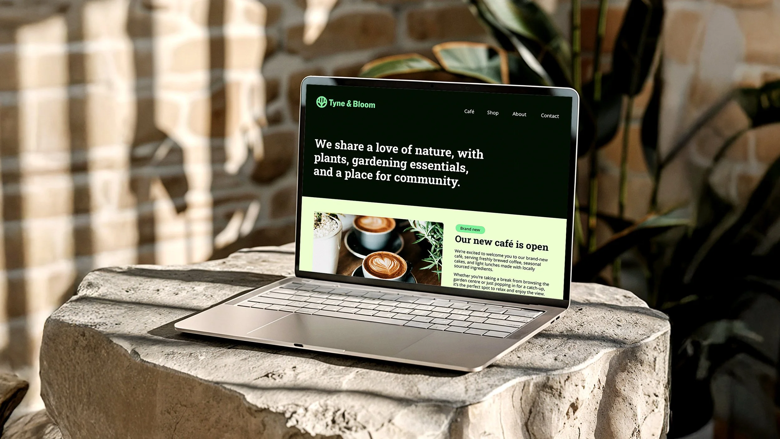
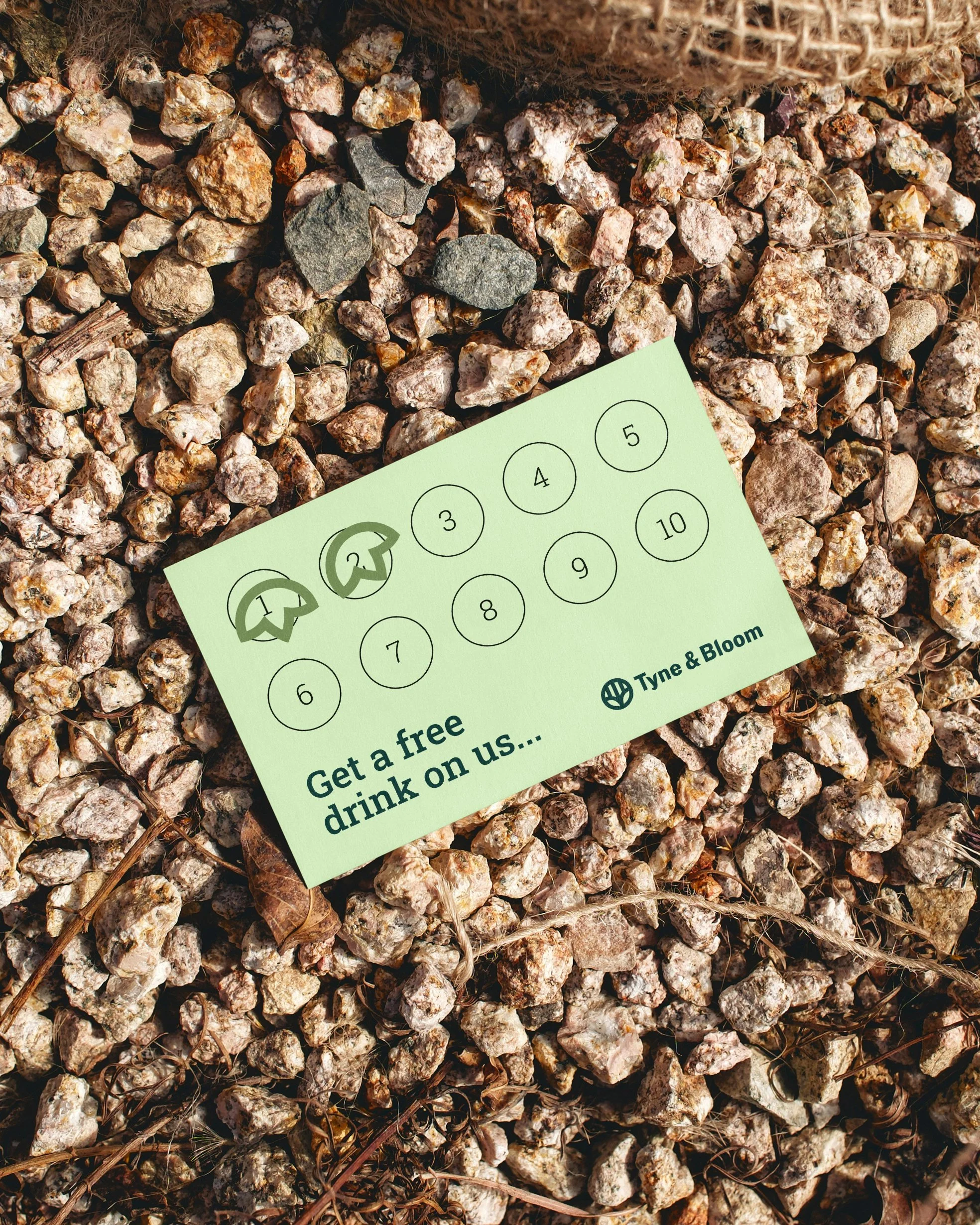
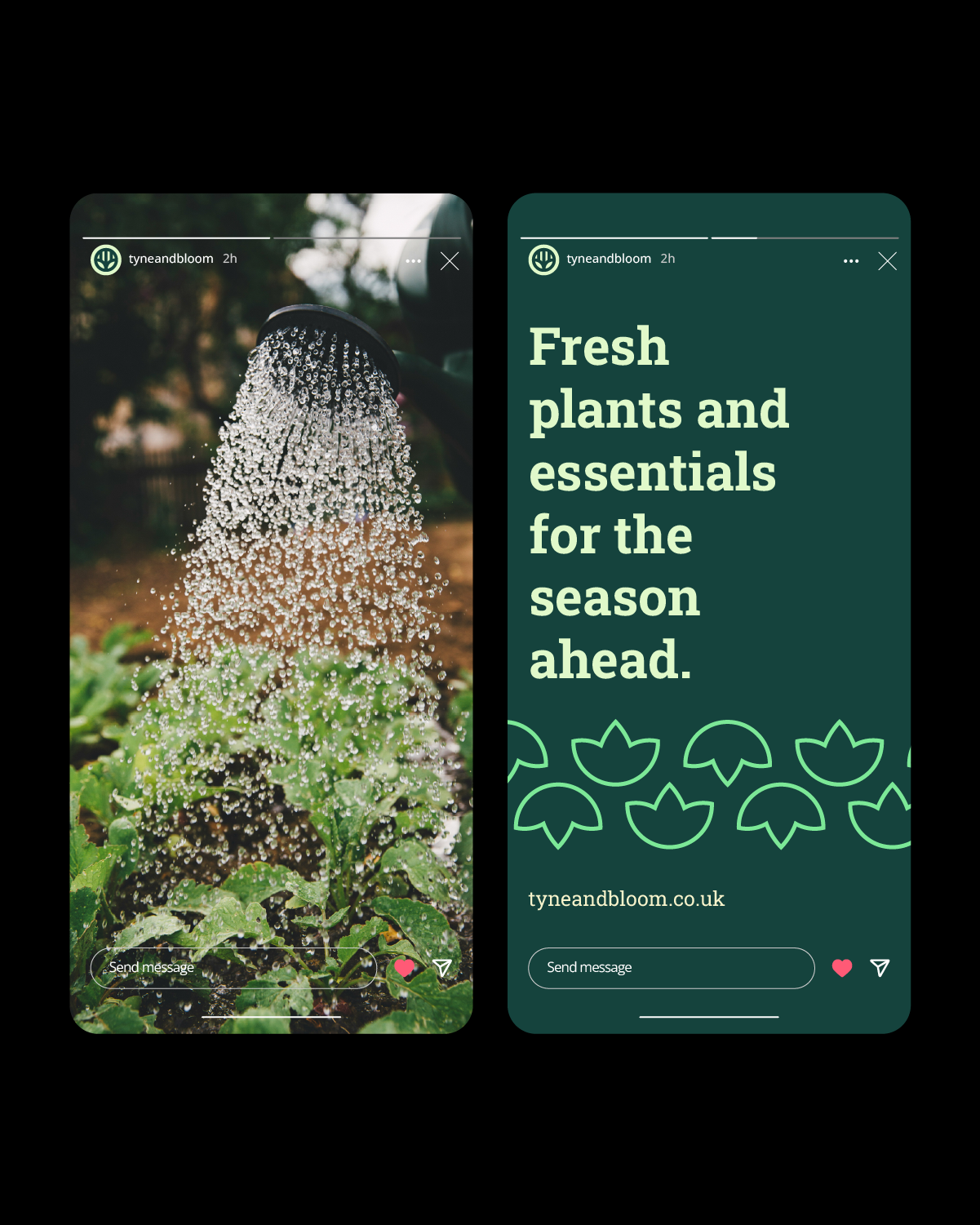
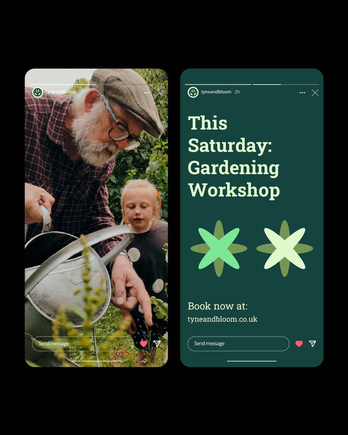
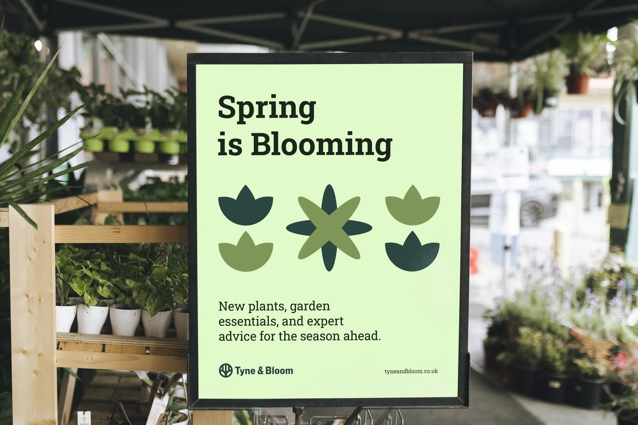
To support the brand, a set of geometric illustrations was developed, inspired by plant and natural forms. These elements bring flexibility to the identity and appear across branded assets. On the loyalty card, the Tyne Bridge motif is reimagined as a stamp mark, reinforcing both place and brand recognition.